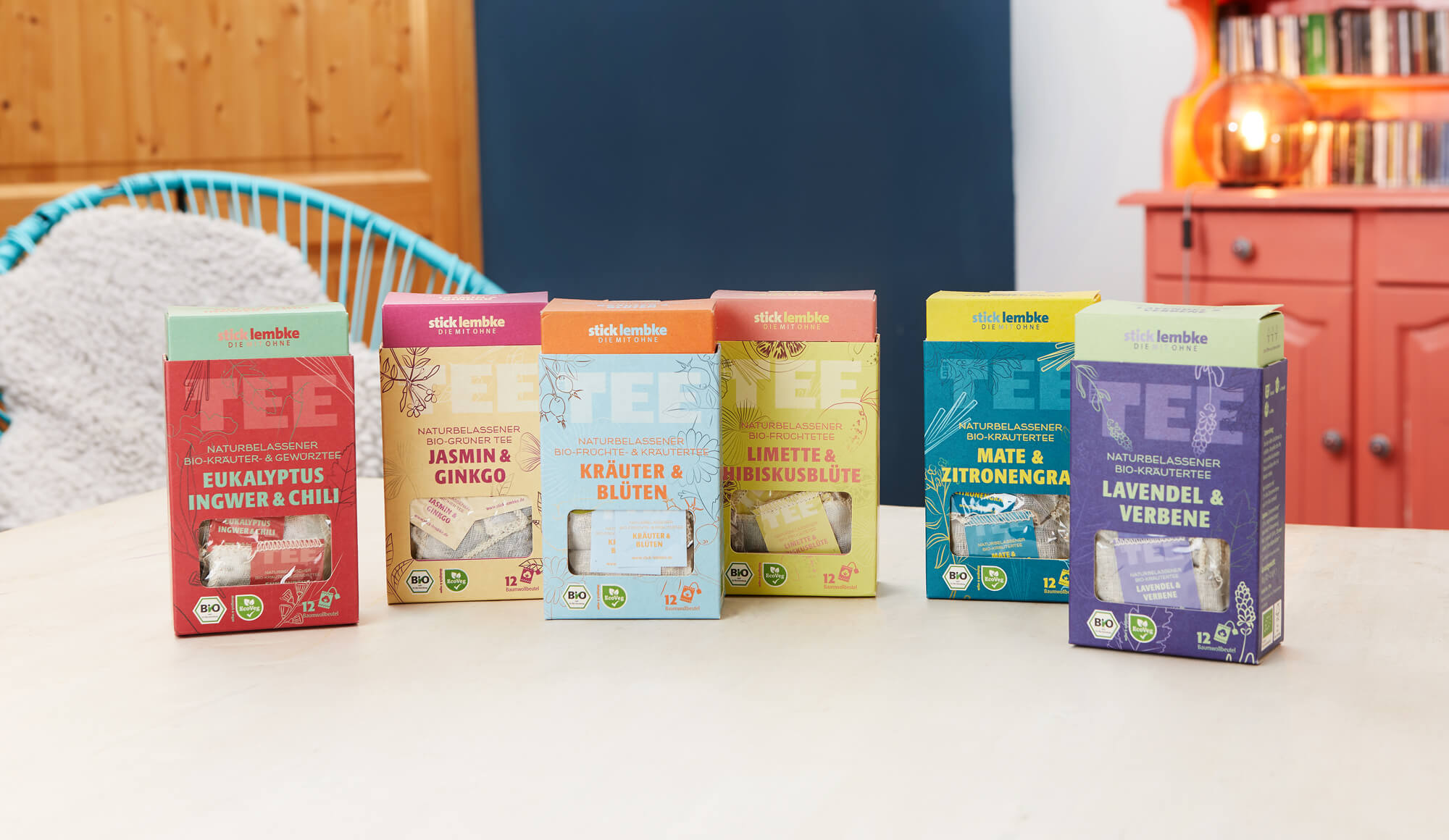
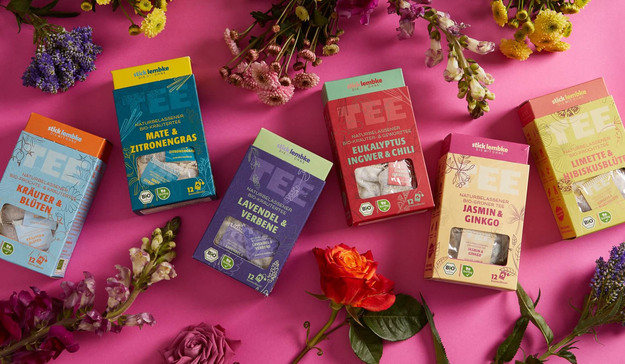
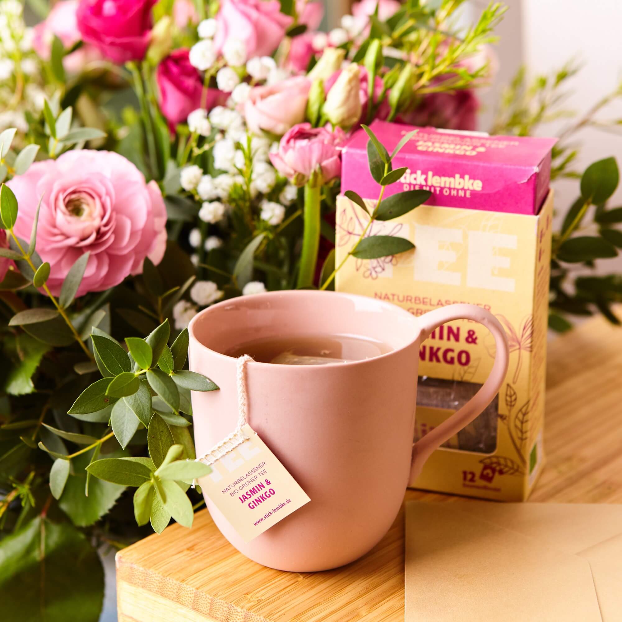
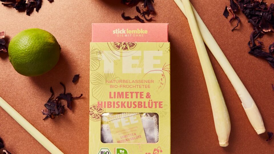
stick&lembke teas stand for pleasure and the sustainable use of natural foods. All teas contain neither natural nor artificial flavors, oils, or artificial additives. The company lives its philosophy of sustainability from sourcing raw materials to packaging: stick&lembke knows the tea farmers and their families personally. The packaging is made from renewable resources.
The packaging of »Tea Beauties« combines elegance with natural beauty and appeals to all the senses. The central design element is a delicate, floral pattern that wraps around the logo like a gentle frame, reflecting the beauty of nature. The color palette is soft and harmonious—muted pastel tones like rosé, sage green, and cream dominate and give the packaging a calm, high-quality presence.
The logo itself is simple and modern, set in a fine serif typeface that recalls classic typography but is interpreted with contemporary lightness. On the front, alongside the logo, there is a small illustration—such as a tea plant or tea leaf—that emphasizes the connection to the product’s natural origin.
The back is clearly structured: information about variety, origin, and brewing instructions is neatly arranged, complemented by a short, poetic quote that invites you to pause and savor. Sustainability is reflected not only in the materials used—the packaging is made from recyclable cardboard—but also in the minimalist design, which avoids unnecessary elements.
Overall, the design of the »Tea Beauties« packaging embodies a modern yet warm appeal: it invites you to experience tea as a sensual ritual and positions the brand as an ambassador for beauty, mindfulness, and pleasure.
Melde dich an und bleib auf dem Laufenden - neue Werke, Kurse & Einblicke direkt aus dem Atelier.
Danke! Bitte bestaetige noch kurz die E-Mail in deinem Postfach.
Cookie-Zustimmung verwalten
Wir verwenden Cookies, um unsere Website und unseren Service zu optimieren.
Funktional
Always active
Die technische Speicherung oder der Zugang ist unbedingt erforderlich für den rechtmäßigen Zweck, die Nutzung eines bestimmten Dienstes zu ermöglichen, der vom Teilnehmer oder Nutzer ausdrücklich gewünscht wird, oder für den alleinigen Zweck, die Übertragung einer Nachricht über ein elektronisches Kommunikationsnetz durchzuführen.
Vorlieben
Die technische Speicherung oder der Zugriff ist für den rechtmäßigen Zweck der Speicherung von Präferenzen erforderlich, die nicht vom Abonnenten oder Benutzer angefordert wurden.
Statistiken
Die technische Speicherung oder der Zugriff, der ausschließlich zu statistischen Zwecken erfolgt.Die technische Speicherung oder der Zugriff, der ausschließlich zu anonymen statistischen Zwecken verwendet wird. Ohne eine Vorladung, die freiwillige Zustimmung deines Internetdienstanbieters oder zusätzliche Aufzeichnungen von Dritten können die zu diesem Zweck gespeicherten oder abgerufenen Informationen allein in der Regel nicht dazu verwendet werden, dich zu identifizieren.
Marketing
Die technische Speicherung oder der Zugriff ist erforderlich, um Nutzerprofile zu erstellen, um Werbung zu versenden oder um den Nutzer auf einer Website oder über mehrere Websites hinweg zu ähnlichen Marketingzwecken zu verfolgen.