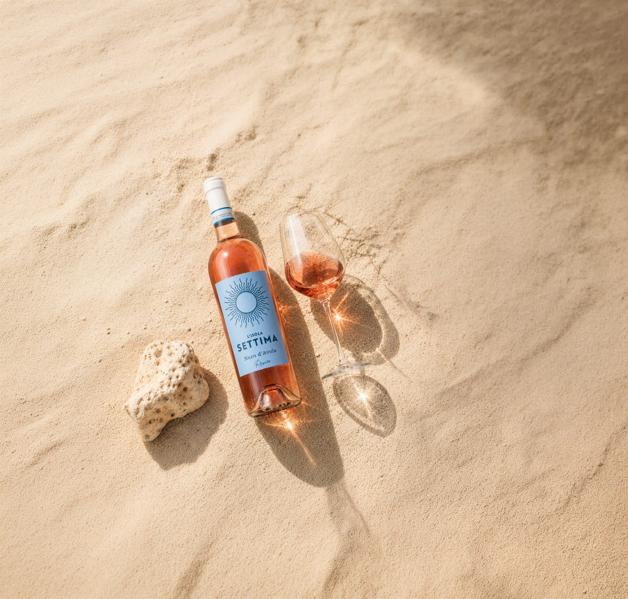
Alibrianza, based in Lombardy, bottles a Rosato with “l’Isola Settima” that tastes entirely of Sicily: 100% Nero d’Avola, aged in stainless steel tanks, with a screw cap, and entirely focused on pure fruit.
The 2025 vintage is dry, juicy, with notes of blood orange, raspberry, and a hint of herbal fragrance – a summer wine with a spicy finish that still impresses in autumn.
The name “l’Isola Settima” sounds like the promise of a secret, seventh island somewhere in the Mediterranean – not marked on any map, known only to those who squint into the sun long enough. Precisely this feeling of heat, light, and expanse was to be captured by the label, without resorting to the cliché box of flamingos and palm trees so often used for rosé wines.
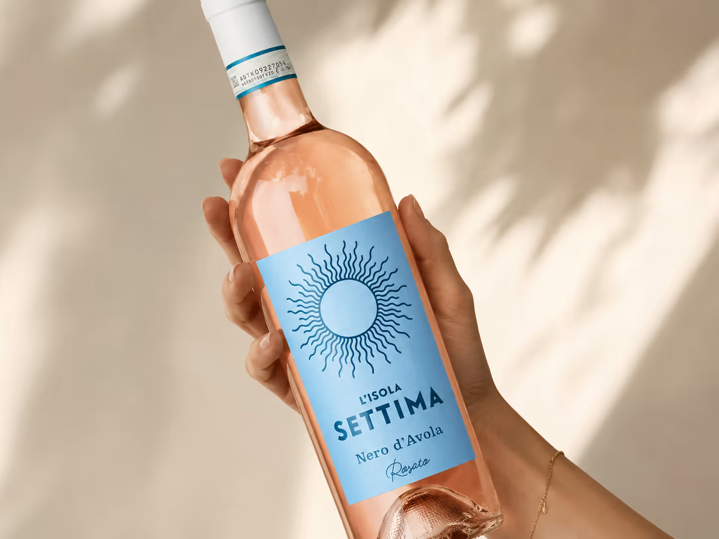
At its center is a radial sun graphic in fine, shimmering lines, like shimmering heat above the water. It sits on a restrained, cloudily glazed light blue that is more reminiscent of a midday sky than the sea, leaving the stage to the strong rosé color of the bottle itself. The typography combines a slender, geometric uppercase font for “L’ISOLA” with a strong, slightly angular headline for “SETTIMA” – and concludes with a handwritten “Rosato” that gives the otherwise strict label a sun-drenched, casual touch.
For design development, project management, and final artwork, I accompanied the label from the first sun sketches to the production-ready file – coordinated for the screw cap and the light rosé bottle, which carries the light of the “seventh island” from within.