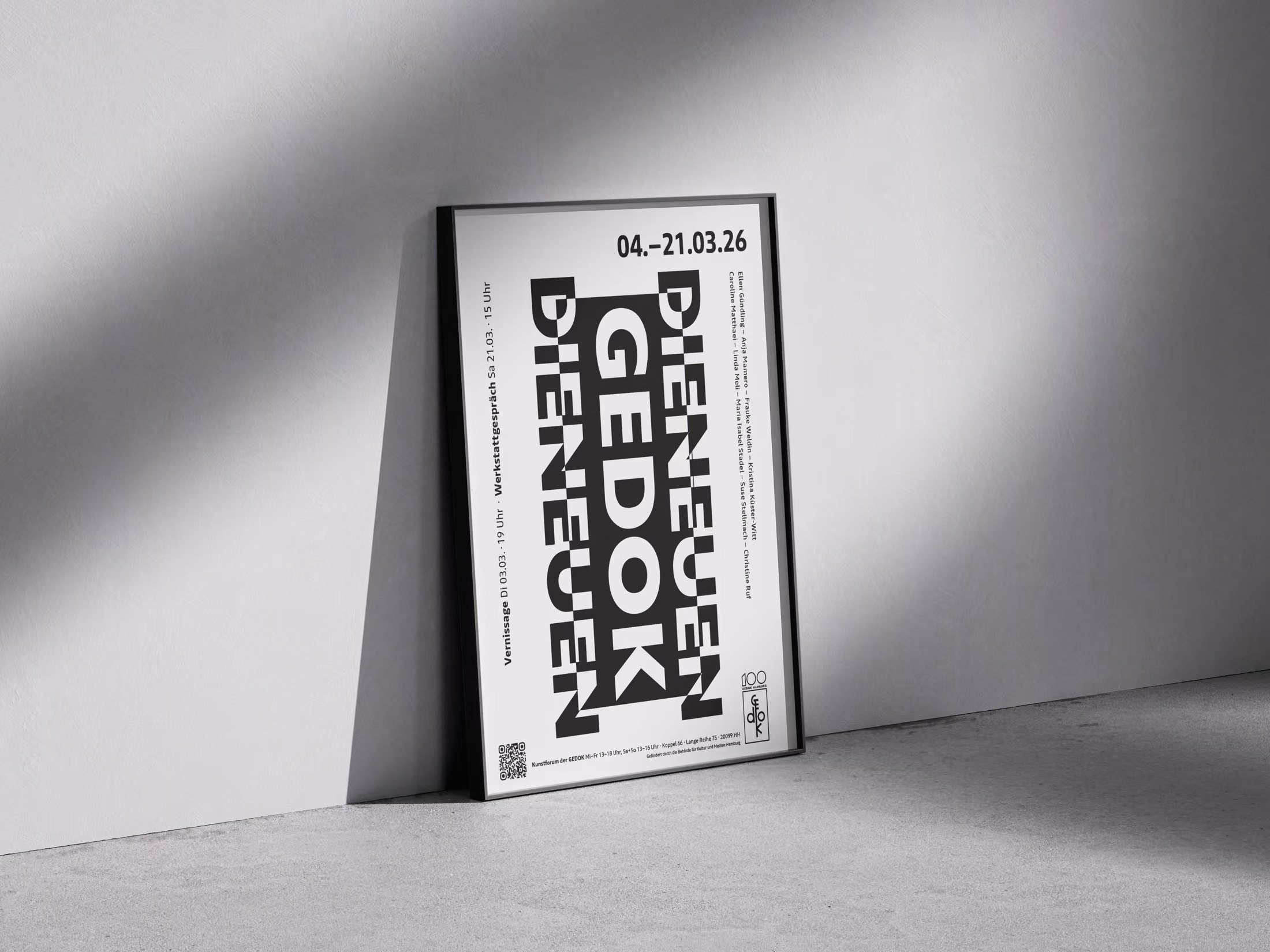
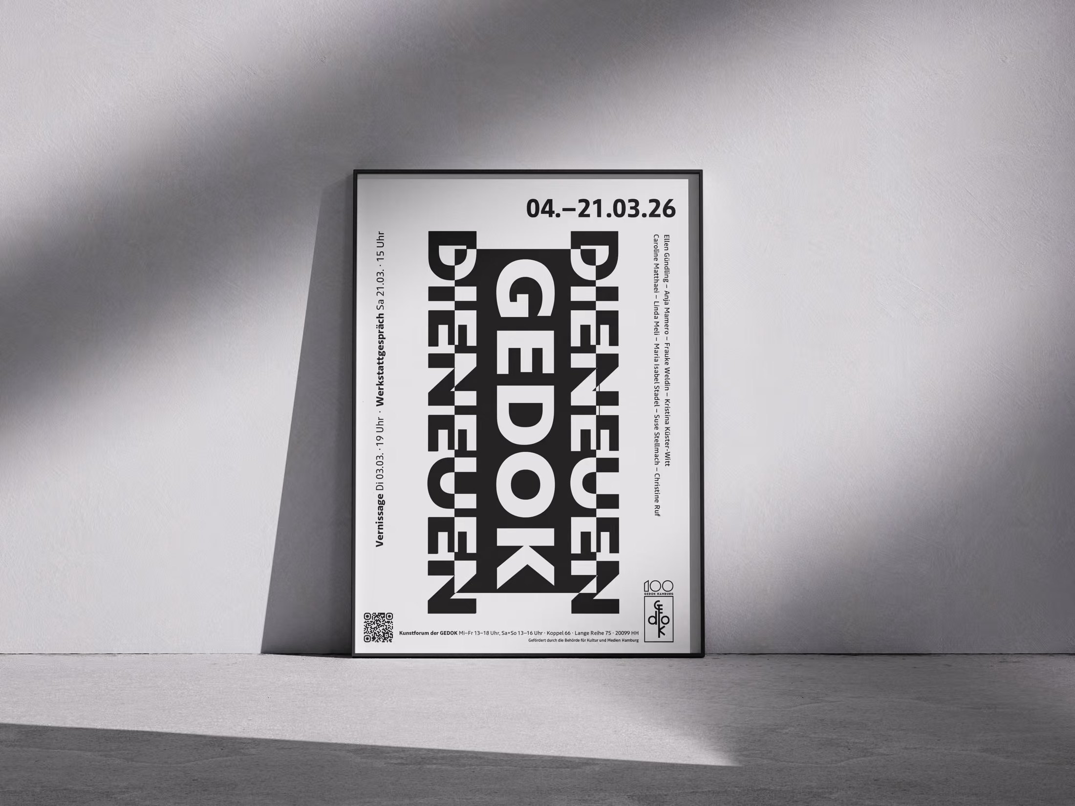
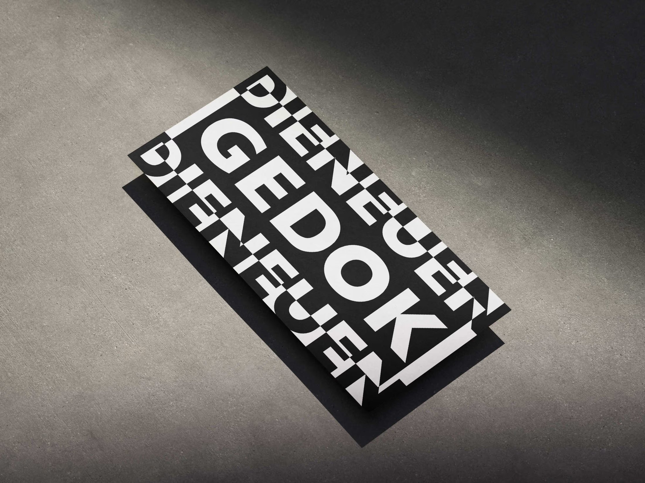
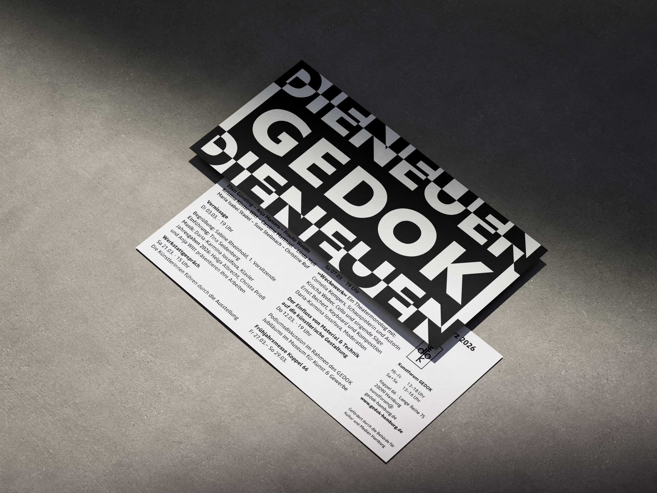
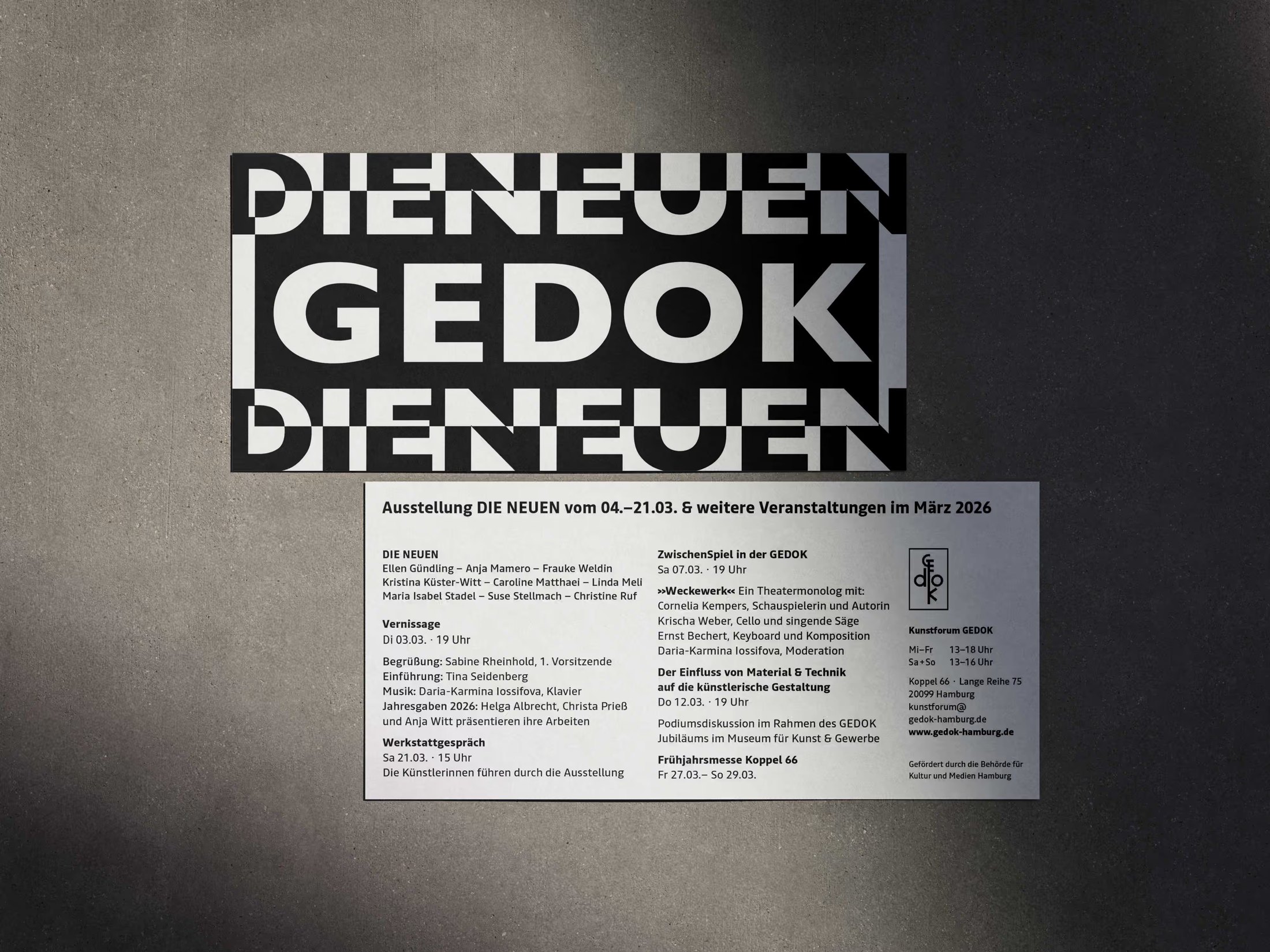
“Wir sind die Neuen” – under this title, GEDOK Hamburg introduces newly admitted artists. I designed the visual identity, including the poster and flyer, for the group exhibition at Kunstforum der GEDOK (March 4–21, 2026).
Nine artists, nine distinct styles: from painting and graphics to photography, printmaking, and sculpture. The design aimed to unify this diversity without flattening it – a clear, confident presentation for a new beginning.
My Services
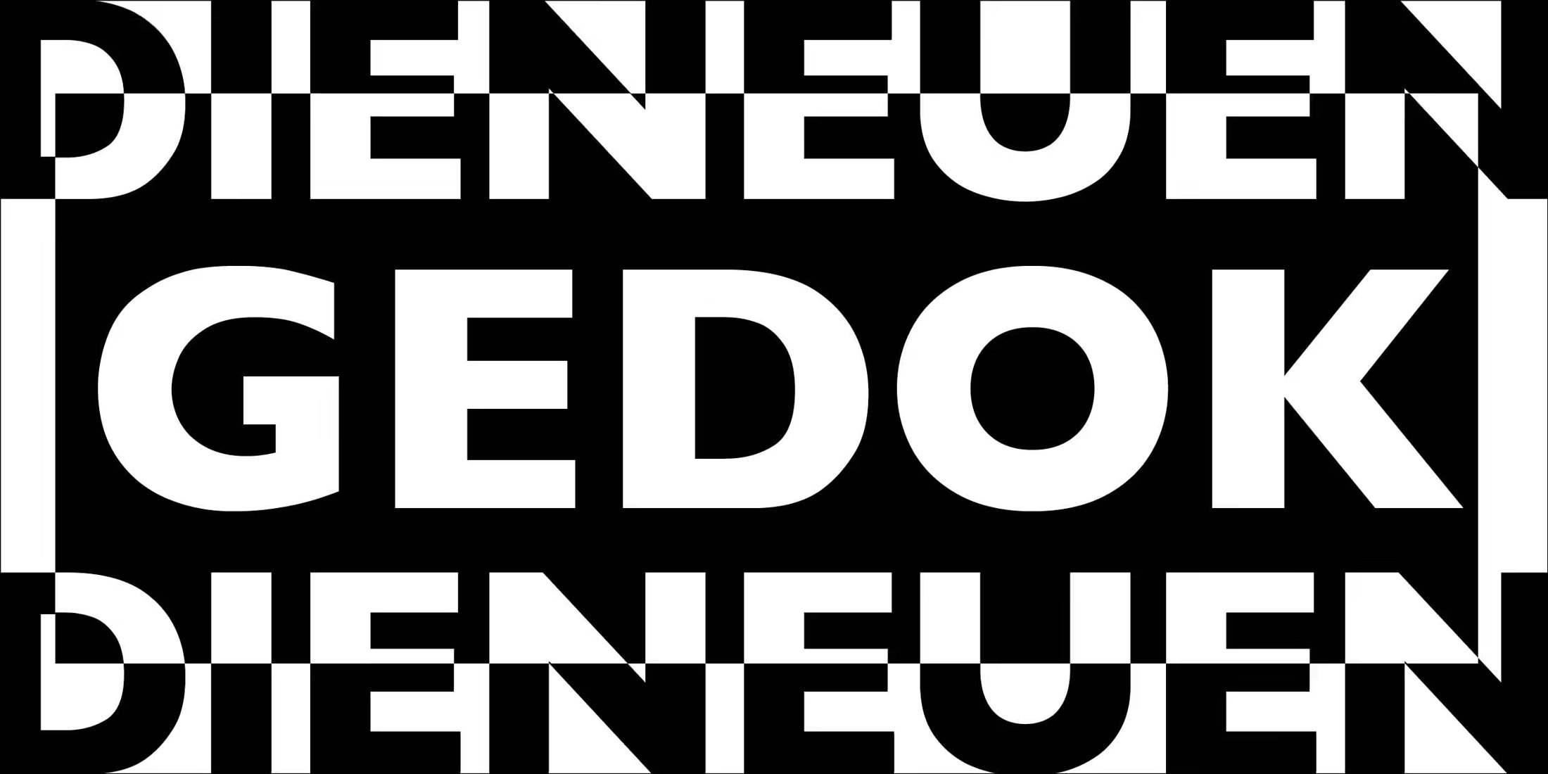
The motif used to introduce GEDOK’s new members each year needed a rebrush. Recognisability had to be preserved – yet, for GEDOK’s 100th anniversary, a small visual twist was meant to do justice to this »new beginning«.
With a design nod to the Japanese »Notan« technique – a Japanese design principle that translates as “light and dark”; in craft and art education it refers to a black-and-white contrast image made of paper, in which cut-out shapes are folded outward to create a mirror image of positive and negative space – I reworked the motif and derived the flyer and poster from it.
Sometimes it doesn’t take much: the powerful, high-contrast typography forms the frame that holds together the artistic diversity of »die Neuen« while giving them room to breathe.
Newsletter
Du willst nichts mehr verpassen?
Melde dich an und bleib auf dem Laufenden - neue Werke, Kurse & Einblicke direkt aus dem Atelier.
Danke! Bitte bestaetige noch kurz die E-Mail in deinem Postfach.
Cookie-Zustimmung verwalten
Wir verwenden Cookies, um unsere Website und unseren Service zu optimieren.
Funktional
Always active
Die technische Speicherung oder der Zugang ist unbedingt erforderlich für den rechtmäßigen Zweck, die Nutzung eines bestimmten Dienstes zu ermöglichen, der vom Teilnehmer oder Nutzer ausdrücklich gewünscht wird, oder für den alleinigen Zweck, die Übertragung einer Nachricht über ein elektronisches Kommunikationsnetz durchzuführen.
Vorlieben
Die technische Speicherung oder der Zugriff ist für den rechtmäßigen Zweck der Speicherung von Präferenzen erforderlich, die nicht vom Abonnenten oder Benutzer angefordert wurden.
Statistiken
Die technische Speicherung oder der Zugriff, der ausschließlich zu statistischen Zwecken erfolgt.Die technische Speicherung oder der Zugriff, der ausschließlich zu anonymen statistischen Zwecken verwendet wird. Ohne eine Vorladung, die freiwillige Zustimmung deines Internetdienstanbieters oder zusätzliche Aufzeichnungen von Dritten können die zu diesem Zweck gespeicherten oder abgerufenen Informationen allein in der Regel nicht dazu verwendet werden, dich zu identifizieren.
Marketing
Die technische Speicherung oder der Zugriff ist erforderlich, um Nutzerprofile zu erstellen, um Werbung zu versenden oder um den Nutzer auf einer Website oder über mehrere Websites hinweg zu ähnlichen Marketingzwecken zu verfolgen.